
A pet-user interface is every point where a pet, a person and a piece of technology meet: the screen on the owner’s phone, the button or sensor the animal touches, and the alerts that travel between them. It is wider than app design. A good one works for two very different users at once, a human who reads and taps and an animal who does neither, and it has to stay clear when the stakes are a missed meal or a medical emergency.
This guide explains what the term covers, which design principles hold up in research, how accessibility changes the rules, and what to look for when you judge a pet device or app.
TL;DR
- A pet-user interface has two sides: the human side (screens, alerts, language) and the animal side (buttons, collars, sensors, contact areas). Both must be designed on purpose.
- Research on pet-care apps points to the same basics: few steps to key tasks, consistent layouts, plain language, immediate feedback and a persistent pet profile.
- Accessibility is not an extra. Large touch targets, strong contrast, no pop-ups and an easy undo matter most for older users and people with disabilities.
- Health-adjacent interfaces should separate a signal from a diagnosis and state their limits clearly.
- When a dog must trigger the alert itself, simplicity on the animal side decides whether the system works at all.
Table of Contents
- What a pet-user interface actually means
- Principles that make the owner-side interface clear
- Designing for people with disabilities and older owners
- Finding, comparing and choosing: the adoption interface
- Testing with the people (and animals) who use it
- Our perspective: the dog’s side is the hard part
- Putting it into practice: a quick evaluation guide
- A device designed around the dog’s simplest action
- FAQ
- Sources
What a pet-user interface actually means
Most searches around this phrase land on app design case studies: a pet adoption app, a grooming booking app, a care tracker. Those are interfaces for pet owners. A pet-user interface in the full sense includes the animal as a participant.
Think of three layers:
- The owner layer. Dashboards, notifications, settings, profiles, order screens. This is classic UX work.
- The animal layer. The physical thing a pet touches, wears or triggers: a button, a collar, a sensor, a feeder lever.
- The link between them. What happens after the animal acts: which alert arrives, how fast, in what words, and what the owner can do next.
Overall user experience is the sum of all three plus things like onboarding, packaging and support. The interface is the part you operate or perceive in the moment.
Researchers who study wearable and “on-pet” devices point out that these products raise design problems screen-based apps never face: the need for fast personalization to each animal, and respect for the pet’s dignity through comfortable, safe contact areas. A dog is not a small human user. It cannot read a label, and it will not tolerate a device that irritates it for long.
Why the animal side is easy to neglect
People who design apps know how to test a screen. Testing what a dog will actually press, nudge or wear takes patience and repetition, so teams often skip it. The result is a polished app wrapped around a device the animal ignores. We cover safer testing habits for pet tech in our piece on pet testing rules that make tech safer.
Principles that make the owner-side interface clear
Pet-care apps are a good laboratory because their users are busy, often stressed and sometimes worried about a sick animal. Several academic sources agree on the basics.
Keep the path short
A 2026 study of a pet-care app in the International Journal of Advanced Research in Computer and Communication Engineering aims for key services within three taps of the dashboard, such as booking grooming or ordering food. Three is not a law of nature, but it is a useful check: if an owner has to dig for the thing they open the app for, the menu is doing too much.
Make the system talk back
The same evaluation uses familiar usability heuristics: visible system status, language that matches the real world, user control and freedom, and consistency across screens. For a pet device this has a concrete meaning. If a dog presses a button, the owner should see that the alert was sent, to whom, and whether it was received. Silence reads as failure.
Limit navigation and stay consistent
A Swiss report on age-appropriate mobile apps recommends limiting navigation to essentials, keeping layouts and terminology consistent, using recognizable icons and large touch targets, and giving immediate feedback. It also advises avoiding pop-ups, using a single-page layout where possible, and carousel navigation when content needs several views.
Use words owners already understand
A 2025 literature review in BMC Veterinary Research on mobile health apps for pet owners stresses terminology that fits the owner’s mental model of illness, and a prominent disclaimer about what the app cannot do. The authors also note that human ideas about disease often do not transfer to animals, so the interface has to guide the user rather than assume knowledge.
Keep one pet profile at the center
The Waka Consulting PetVet case study recommends a persistent pet profile that follows the owner through every service, so context is never lost. The BMC review adds that apps should include documentation features that let owners hand information to a veterinarian, so they do not repeat themselves at every visit.
Do not overclaim
The same Waka study argues that trust in health-adjacent pet interfaces comes from clear language and a calm hierarchy, more than from visual polish, and that an interface should separate an informative signal from a diagnosis. A collar that reports a change in activity is giving a signal. It is not telling you your dog is sick. We make that distinction in our guide to smart dog collar terms and why a 7 to 14 day baseline matters.
Designing for people with disabilities and older owners
Pet ownership is a lifeline for many older adults and disabled people, which makes accessibility a core requirement in this category, not a compliance checkbox.
The Swiss report gives measurable targets: sufficient contrast and text enlargement, touch targets of at least 12 mm with touch-sensitive areas of at least 15 × 15 mm, no pop-ups, consistent navigation, and the ability to undo unintended actions.
Two more recent papers point the same way:
- A 2026 persona-based mapping of WCAG 2.2 for older adults finds that legibility, contrast and tolerance for touch errors should be high-priority criteria, because they protect basic autonomy.
- A 2025 arXiv study on accessibility recommendations suggests always offering undo or reset, especially when people configure accessibility or personalization settings.
In practice, this checklist is worth running on any pet app or device companion screen:
| Check | What to look for |
|---|---|
| Touch targets | Buttons large enough to hit with a tremor or limited dexterity |
| Contrast and text | Readable at a glance, enlargeable without breaking the layout |
| Interruptions | No pop-ups covering the one control you need |
| Mistakes | A visible undo or reset after any change |
| Consistency | Same place, same label, same icon on every screen |
| Status | Clear confirmation that an alert or command went through |
If you or someone you care for lives with a disability, our articles on barrier-free pet devices and practical pet care tips for people with disabilities go deeper on what to ask for.
Finding, comparing and choosing: the adoption interface
Interfaces also help people choose an animal. A 2024 study presented in CEUR Workshop Proceedings found that adopters value detailed pet profiles and filters for location, age, size, breed, gender, personality, medical condition and compatibility, plus a favorite feature to revisit saved animals. The authors also suggest playful form elements, such as picking from predefined options instead of typing freely, to keep people engaged when they send an adoption inquiry.

The lesson carries over to any pet product: let people narrow choices by what matters to them, remember what they saved, and cut free-text typing where a tap will do.
Testing with the people (and animals) who use it
A good interface is a tested one. The Little Paw study followed the Double Diamond method, with user research and iterative testing, and reported better navigational efficiency and easier discovery of services. Interviews and short usability sessions with real owners reveal problems no internal review catches: a hidden menu, an unclear icon, a label that only the design team understands.
For the animal side, testing means watching real dogs over days, not minutes. Does the dog press the control on its own, in a calm moment and in a noisy one? Does the device stay comfortable and in place? Does a false trigger happen often enough to make the owner stop trusting alerts? Our article on the role of user-centered pet devices explains how we think about that loop.
Our perspective: the dog’s side is the hard part
We build communication tools for dogs and the people who depend on them, so we see the whole chain every day. Here is what we have learned to care about.
The best animal interface is the one the dog already understands. A dog does not need to learn a menu. It needs one clear action that leads to one clear result. That is why the iPupPee device is built around a simple button press that sends a notification, rather than a set of options the dog would have to choose from.
The owner screen must be calm. When an alert arrives, a person living alone, a senior, or a handler with a disability should not have to decode anything. Who is asking, what happened, what can I do now: that is the whole screen. Live video and two-way audio only help if they open quickly and without fuss.
More contacts, fewer single points of failure. Notifications that can reach several people, not only one phone, make a system more dependable. Our device is designed to send alerts to multiple contacts, and it works without a monthly subscription fee.

Training is part of the interface. A button means nothing to a dog until the dog connects it with an outcome. That is why we pair the hardware with training guides and a course on dog psychology, and why we read dog behavior as seriously as we read screens. You can see how we think about it on our dog psychology page.
Signals are not diagnoses. An alert tells you your dog asked for you. It does not tell you why. We would rather say so plainly than let anyone believe a device replaces a veterinarian or a medical professional.
— Andrew
Putting it into practice: a quick evaluation guide
Use these questions on any pet app, collar, button or smart device before you buy or build.
- Who is the second user? If the answer is only the owner, the animal side has probably been ignored.
- What does the animal do, exactly? One simple, natural action beats a learned sequence.
- What does the owner see in the first five seconds? The answer should be obvious without reading.
- How many taps to the key task? More than three deserves a second look.
- Can mistakes be undone? Especially for settings.
- Does it claim too much? Look for a clear line between a signal and a diagnosis, and a visible statement of limits.
- Does it work for the people who need it most? Test with large text, low vision or limited dexterity in mind.
- What do you pay over time? Check whether features depend on a recurring plan.
If wearables are what you are weighing, our overview of wearable tech for dogs, safety, alerts and independence puts these questions in context, and our look at how AI supports pet care shows where automated signals help and where they stop.
A device designed around the dog’s simplest action
If you want a working example of a two-sided interface, the iPupPee device is ours. A dog presses a button, and the people you choose get a Wi-Fi notification with live video and two-way audio, so you can see your dog and speak to it. It is made for service dog teams, seniors, disabled owners and anyone who wants a dependable alert from a dog of any size. It costs $129.99 as a one-time purchase.
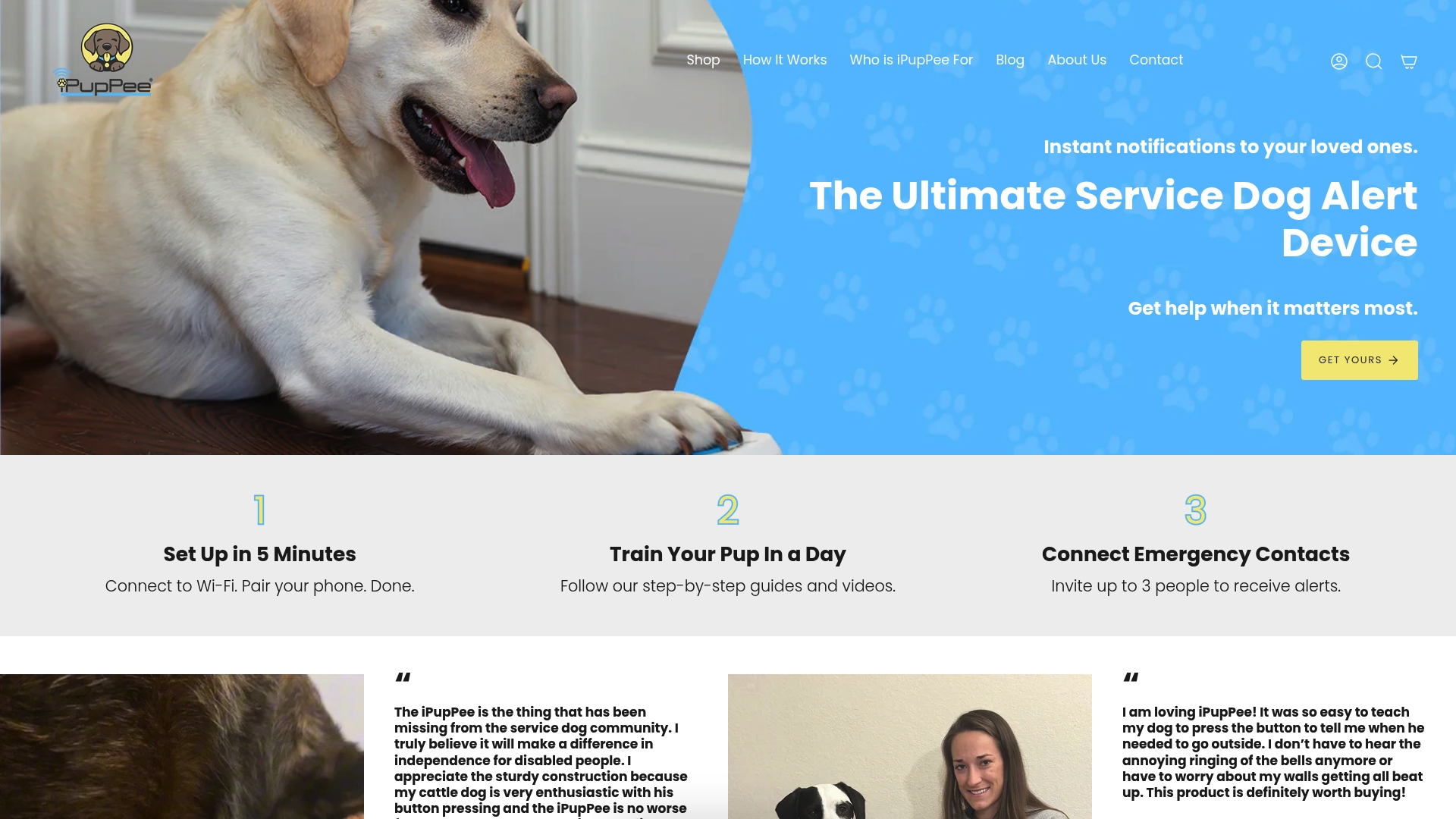
The button only works once your dog knows what it does. Our Psychology & Training Course, $119 one-time, teaches the dog psychology and training steps behind that, and you can add shipping protection for $5.00 at checkout. For a gentler start, read our guide to accessible pet training methods and tools.
FAQ
What is a pet-user interface?
It is the set of touchpoints through which a pet, its owner and a technology product interact. That includes the owner’s screens and notifications as well as the physical controls, collars or sensors an animal touches or wears. A complete design treats both as users.
How is it different from an app’s user experience?
User experience covers the whole journey, including onboarding, support and packaging. The interface is the part you see, tap or trigger in the moment. For pet products, the interface also includes what the animal does and what feedback the owner gets in return.
What are the most important design principles for pet-care apps?
Research keeps returning to a few: short paths to key tasks, consistent layouts and terminology, immediate feedback, plain language and a persistent pet profile. Health-related apps should also state their limits and separate signals from diagnoses.
How can pet tech be made accessible for older or disabled owners?
Use large touch targets, strong contrast, enlargeable text, no pop-ups, consistent navigation and an easy way to undo mistakes. Test with real users who have limited vision or dexterity, not only with a checklist. Our guide for disabled pet owners covers the owner’s side.
Sources
- On-Pet Interaction (academic paper)
- Age-appropriate mobile applications, ZHAW report
- Pet care mobile application, IJARCCE 2026
- Towards mHealth applications for pet animal owners, BMC Veterinary Research
- PetVet pet-care app UX design case study
- Persona-based WCAG 2.2 mapping for mobile accessibility
- Accessibility recommendations for designing better mobile apps, arXiv
- Bricman and Kožuh, pet adoption interfaces, CEUR Workshop Proceedings